ギフトガイド
最適な星空マップデザインの選び方
形、色、文字、レイアウトを整えて上品な星空マップを作る方法。
星空マップデザインの選び方
形、色、文字、レイアウトを整えて上品な星空マップを作る方法。 日本のユーザーには、個人的でありながら部屋に飾りやすい落ち着いたギフトとして伝えることが大切です。
パーソナライズプリントでは、何を描くかだけでなく、その瞬間をなぜ飾るのかが大切です。
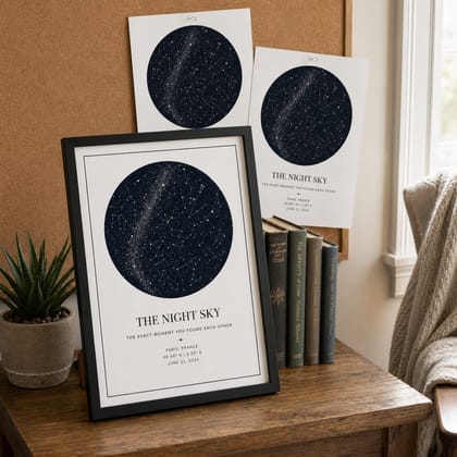
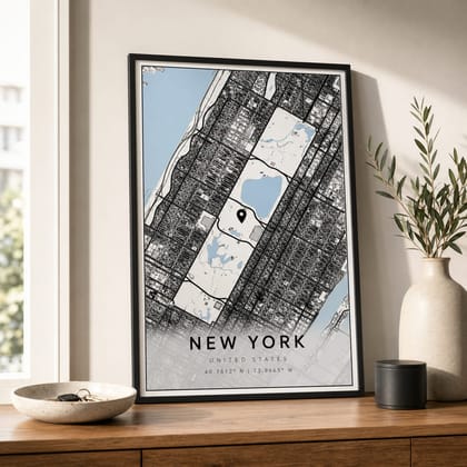
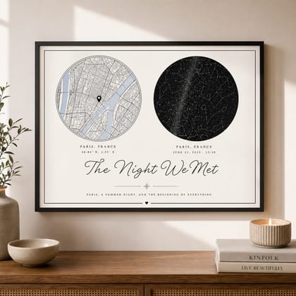
星空マップデザインは、日付・時間・場所がはっきりしている思い出に向いています。自然な言葉は名入れギフト、オーダーメイドギフト、星空ポスター、星空マップ、月齢ポスター、月相マップ、地図ポスター、写真入りギフトです。
具体的に選びやすいように、要点を明確にしています。
星空マップデザインが合う贈り物
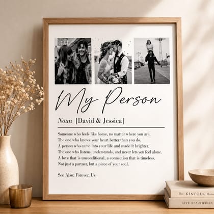
長く飾れる星空マップにするためのデザイン判断。 日付、場所、写真を見た瞬間に思い出が伝わる場合、このギフトは特に自然に響きます。
受け取る人がすぐに物語を理解できると、ギフトはより自然で特別に感じられます。
東京、横浜、京都、大阪、札幌、福岡、神戸、名古屋、金沢、鎌倉、結婚式場、母校、新居の住所のような具体的な場所を入れると、その人だけの記念品として伝わりやすくなります。
アイデアだけでなく、実際に選びやすい内容にしています。
星空マップデザインの作成前に用意する情報
見せる情報は、名前、日付、場所、短いメッセージに絞るのがおすすめです。長い文章はカードに分けると、ポスターが上品に見えます。
入力情報を整理しておくと修正が少なくなり、購入しやすいプレビューを作れます。
表示する情報は、名前、日付、場所、短いメッセージに絞ります。長い文章はカードに分ける方が、余白がきれいに残ります。
事前準備をしておくと、エディターで迷う時間を減らせます。
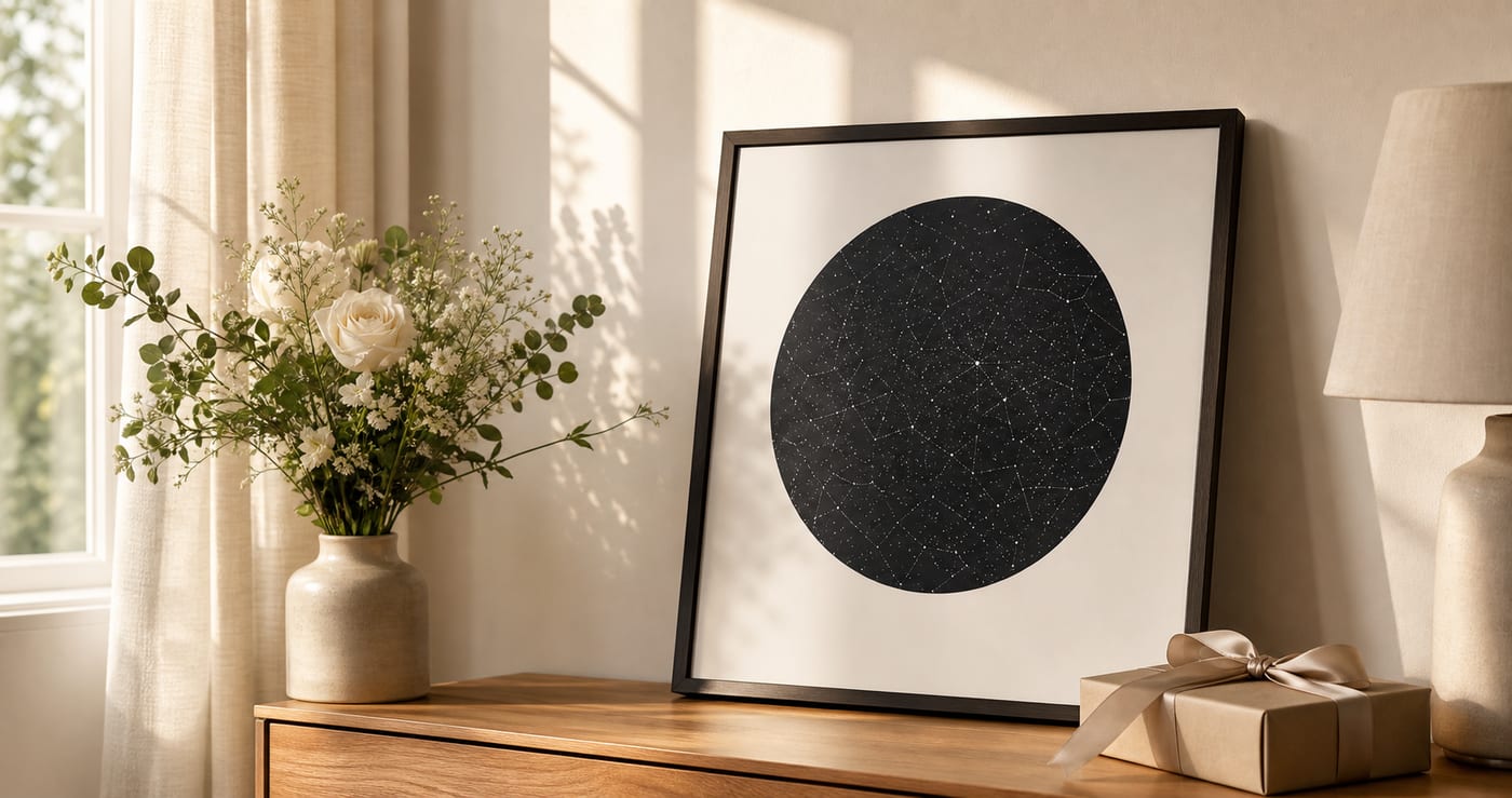
暮らしになじむ星空マップデザインの見せ方
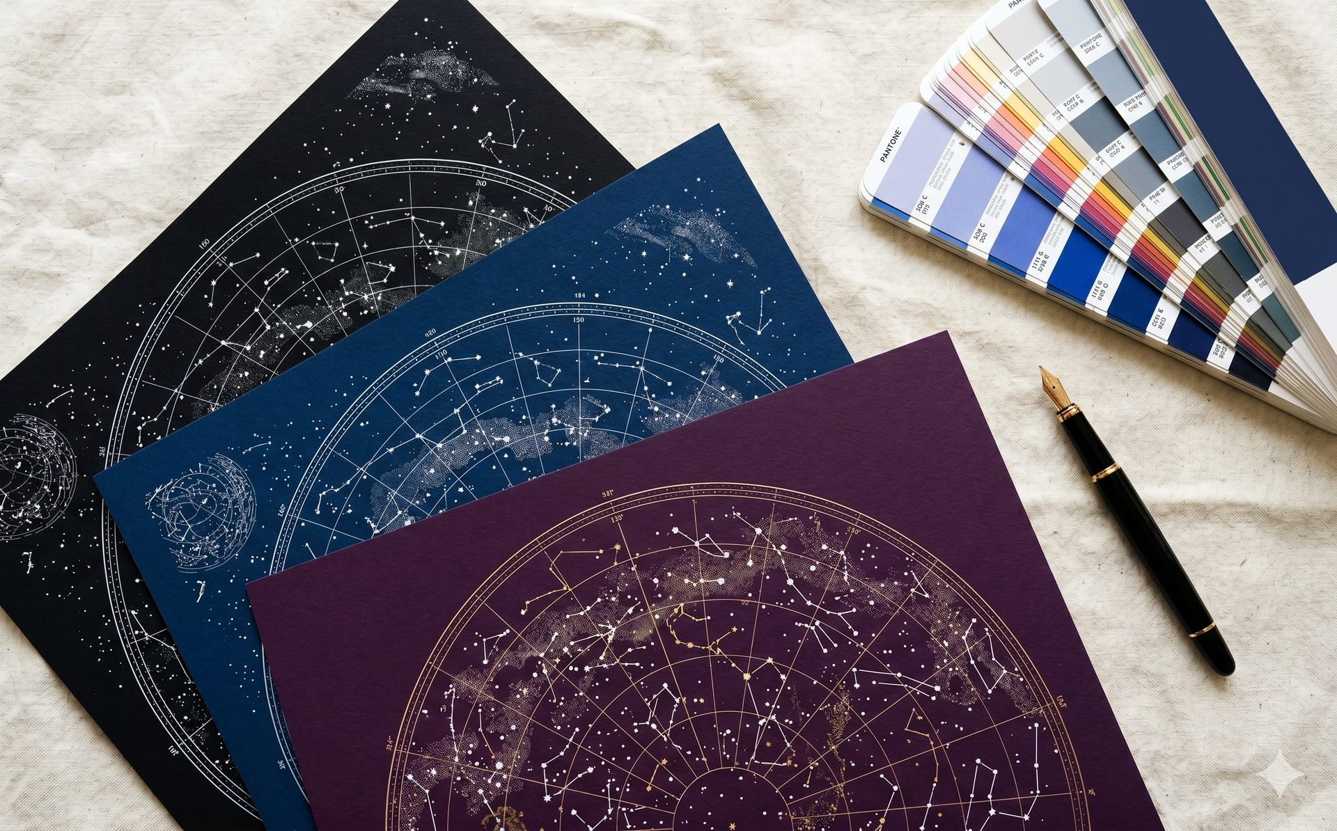
日本語では余白と文字量のバランスが重要です。クリーム、白、黒、木目など、暮らしになじむ色を選ぶと長く飾れます。
海外の利用者にも伝わりやすいよう、強い流行よりも落ち着いた室内向けの見た目を重視します。
表現は控えめで上品、余白を大切にした表現が合います。A3または30x40cmは贈りやすく、50x70cmは主役の壁面に向いています。
商品写真だけでなく、実際の部屋で自然に見えることを重視しています。
星空マップデザインの注文前に知っておきたいこと
この記事では、何のギフトか、誰に向いているか、必要な情報、選び方を、初めて読む人にも分かりやすい順番で整理しています。
そのため各ページは、定義、用途、必要な情報、デザイン、購入判断の順に分かりやすく構成しています。
安心感は購入前のプレビュー、読みやすい文字、落ち着いた色、サイズの分かりやすさから生まれます。強い色より、読みやすい文字と余白の方が長く飾りやすくなります。
明確な回答があると、読んだ人が迷わず次の判断に進めます。
星空マップデザインをプレビューで確認する
まず実際の情報でプレビューを作り、タイトル、メッセージ、画像、サイズの見え方を確認するのが一番確実です。
プレビュー後はサイズとフレームを選ぶだけに近くなり、ギフトの意味はすでに確認できます。
実際の日付、場所、名前でプレビューが自然に見えたら、星空マップデザインは注文や比較に進めます。
そのため、記事は発見から注文まで自然につながります。
よくある質問
星空マップデザインはギフトに向いていますか?
+
はい。日付、場所、写真、メッセージに相手との意味がある場合、とても向いています。
どんな情報が必要ですか?
+
基本は名前、日付、場所、短いメッセージです。写真ギフトでは明るく鮮明な画像を使います。
どのサイズが選びやすいですか?
+
A3または30x40cmが選びやすく、50x70cmは主役のインテリア向きです。
購入前に文字を変更できますか?
+
はい。購入前にタイトル、メッセージ、色、レイアウトをプレビューで確認できます。
星空マップデザインにはどんな言葉が自然ですか?
+
名入れギフト、オーダーメイドギフト、星空ポスター、星空マップ、月齢ポスター、月相マップ、地図ポスター、写真入りギフトのような言葉が自然です。英語の商品名を直訳するより、贈り物として分かりやすくなります。
どんな場所を使えますか?
+
東京、横浜、京都、大阪、札幌、福岡、神戸、名古屋、金沢、鎌倉、結婚式場、母校、新居の住所だけでなく、小さな町、住所、結婚式場、座標、思い出の場所も使えます。
日本の部屋に合う色はどれですか?
+
白、クリーム、黒、グレー、木目に近い色は合わせやすいです。強い色を使うより、文字を読みやすくして余白を残す方が長く飾れます。
始めましょう
自分だけのパーソナルギフトを作成
大切な瞬間、言葉、色、仕上げを選び、注文前にエディタでデザインを確認できます。
パーソナルギフトを作る