ギフトガイド
メモリーポスターの作り方: 写真コラージュ案
写真、レイアウト、文字、メッセージを選んで上品なメモリーポスターを作る方法。
メモリーポスターを上品に見せる条件
メモリーポスターは、写真を多く入れるほど良いわけではありません。少ない写真、余白、短いタイトルがあるほうが、部屋に飾りやすくなります。
パーソナライズプリントでは、何を描くかだけでなく、その瞬間をなぜ飾るのかが大切です。
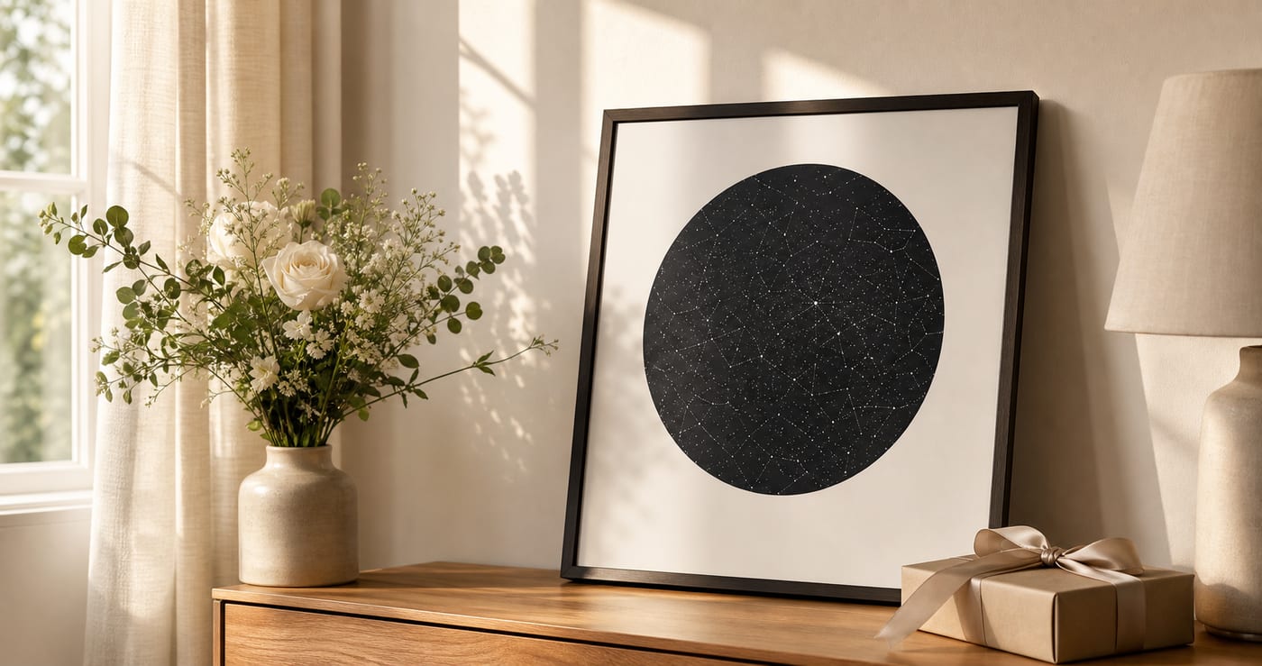
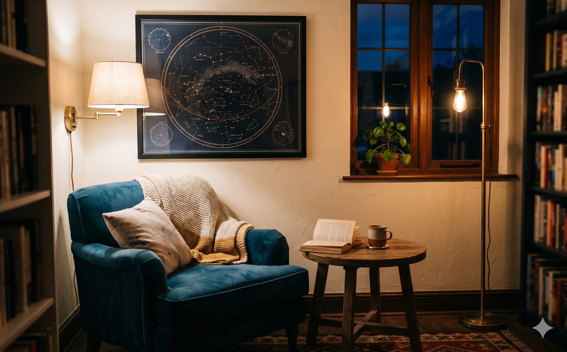
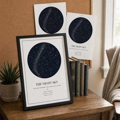
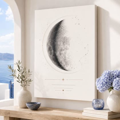
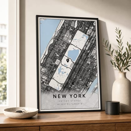
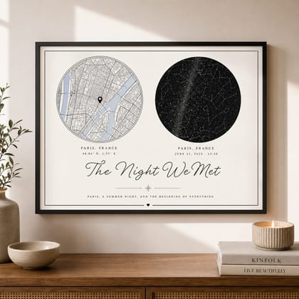
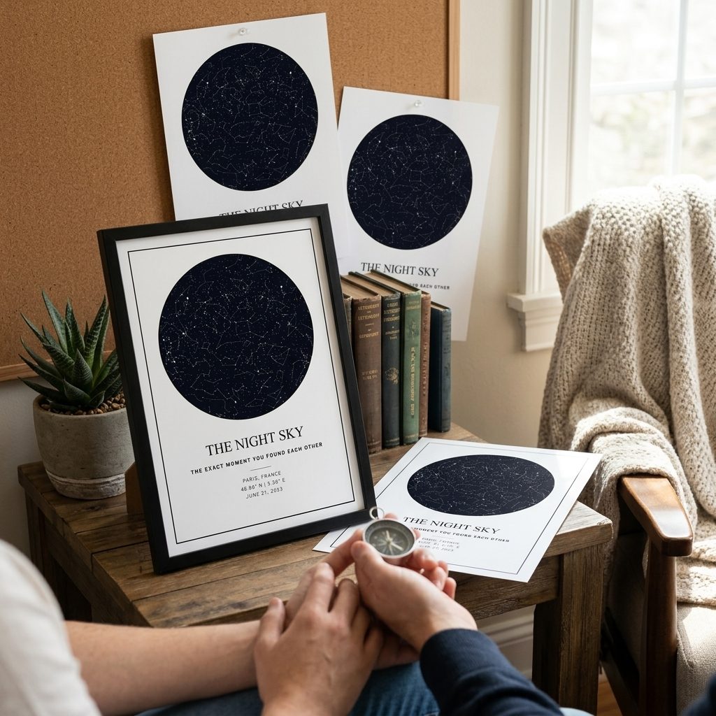
写真メモリーポスターは、日付・時間・場所がはっきりしている思い出に向いています。自然な言葉は名入れギフト、オーダーメイドギフト、星空ポスター、星空マップ、月齢ポスター、月相マップ、地図ポスター、写真入りギフトです。
具体的に選びやすいように、要点を明確にしています。
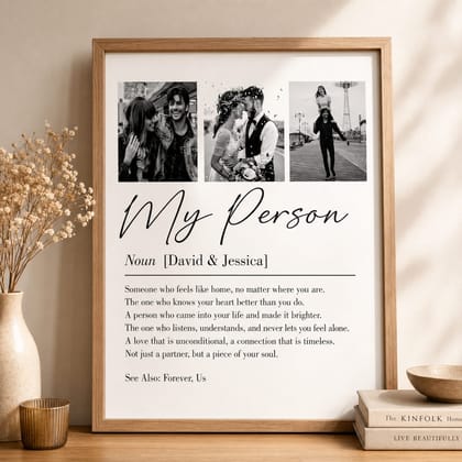
一緒に並べやすい写真を選ぶ
明るさ、色味、撮影時期が近い写真を選ぶと統一感が出ます。スクリーンショットや暗い写真を混ぜると、印刷時に雑に見えやすくなります。
受け取る人がすぐに物語を理解できると、ギフトはより自然で特別に感じられます。
東京、横浜、京都、大阪、札幌、福岡、神戸、名古屋、金沢、鎌倉、結婚式場、母校、新居の住所のような具体的な場所を入れると、その人だけの記念品として伝わりやすくなります。
アイデアだけでなく、実際に選びやすい内容にしています。
詰め込みより整ったグリッド
おすすめは、一枚を大きく見せる構成、4枚グリッド、6枚グリッドです。写真が多すぎると顔が小さくなり、思い出が伝わりにくくなります。
入力情報を整理しておくと修正が少なくなり、購入しやすいプレビューを作れます。
表示する情報は、名前、日付、場所、短いメッセージに絞ります。長い文章はカードに分ける方が、余白がきれいに残ります。
事前準備をしておくと、エディターで迷う時間を減らせます。
文字は短くする
文字はタイトル、名前、日付、短い一文までにします。長いメッセージはカードに分けると、ポスターの余白がきれいに残ります。
海外の利用者にも伝わりやすいよう、強い流行よりも落ち着いた室内向けの見た目を重視します。
表現は控えめで上品、余白を大切にした表現が合います。A3または30x40cmは贈りやすく、50x70cmは主役の壁面に向いています。
商品写真だけでなく、実際の部屋で自然に見えることを重視しています。
色と余白の考え方
白、クリーム、黒、木目など落ち着いた色は、日本の部屋にも合わせやすいです。写真がカラフルなときほど背景は静かにします。
そのため各ページは、定義、用途、必要な情報、デザイン、購入判断の順に分かりやすく構成しています。
安心感は購入前のプレビュー、読みやすい文字、落ち着いた色、サイズの分かりやすさから生まれます。強い色より、読みやすい文字と余白の方が長く飾りやすくなります。
明確な回答があると、読んだ人が迷わず次の判断に進めます。
印刷前にプレビューで確認
プレビューでは、顔が見えるか、文字が詰まっていないか、壁に飾ったときに自然かを確認してください。
プレビュー後はサイズとフレームを選ぶだけに近くなり、ギフトの意味はすでに確認できます。
実際の日付、場所、名前でプレビューが自然に見えたら、写真メモリーポスターは注文や比較に進めます。
そのため、記事は発見から注文まで自然につながります。
よくある質問
写真は何枚が良いですか?
+
1枚、4枚、6枚が使いやすいです。多すぎると一枚一枚が小さくなります。
避けたほうがいい写真は?
+
スクリーンショット、暗い写真、ぼやけた写真、色味が大きく違う写真は避けるときれいです。
何を書けばいいですか?
+
短いタイトル、名前、日付、一文メッセージで十分です。
選びやすいサイズは?
+
A3または30x40cmが選びやすく、50x70cmは写真の解像度が高い場合に向いています。
写真メモリーポスターにはどんな言葉が自然ですか?
+
名入れギフト、オーダーメイドギフト、星空ポスター、星空マップ、月齢ポスター、月相マップ、地図ポスター、写真入りギフトのような言葉が自然です。英語の商品名を直訳するより、贈り物として分かりやすくなります。
どんな場所を使えますか?
+
東京、横浜、京都、大阪、札幌、福岡、神戸、名古屋、金沢、鎌倉、結婚式場、母校、新居の住所だけでなく、小さな町、住所、結婚式場、座標、思い出の場所も使えます。
日本の部屋に合う色はどれですか?
+
白、クリーム、黒、グレー、木目に近い色は合わせやすいです。強い色を使うより、文字を読みやすくして余白を残す方が長く飾れます。
始めましょう
自分だけのパーソナルギフトを作成
大切な瞬間、言葉、色、仕上げを選び、注文前にエディタでデザインを確認できます。
パーソナルギフトを作る